case-study · Sep 24, 2026
Case Study: Verrane Chocolatiers, Autumn Collection
A seasonal collection for a family chocolatier: twelve bars, one box, a campaign shot in a single afternoon. Project facts, the image grid and what we learned.
Verrane Chocolatiers has been making chocolate in the same kitchen for three generations. Every autumn they release a limited collection. This year they asked us to design it.
Project facts
Client: Verrane Chocolatiers, a family-run maker with two shops
Brief: A twelve-bar autumn collection, one gift box, one campaign
Studio role: Concept, packaging, photography direction, shop windows
Timeline: Nine weeks
Shoot: One afternoon, one location, one photographer
Materials: Uncoated stock, blind emboss, a single copper-toned ink
The idea
We started with the kitchen. It is a long, low room with copper pans on the wall and a marble slab where the chocolate is tempered every morning. It smells, unavoidably, of warmth.
The idea followed: make the collection look like the first hour of the morning there. Soft light. Slightly steamed windows. Nobody has arrived yet but the day is clearly about to begin.
The box and the shoot
One box, the same for every bar. We were firm about this. The twelve bars differ only by a small embossed number on the wrapper, one to twelve, and the name of a single ingredient underneath. Hazelnut. Salt. Smoked tea. The boxes themselves are cream, blind-embossed on the lid with a single line.
If you want to understand the discipline (our notes on restraint explain the thinking), the whole print budget went on paper and registration. Colour was a copper ink, used once, for the number on each wrapper.
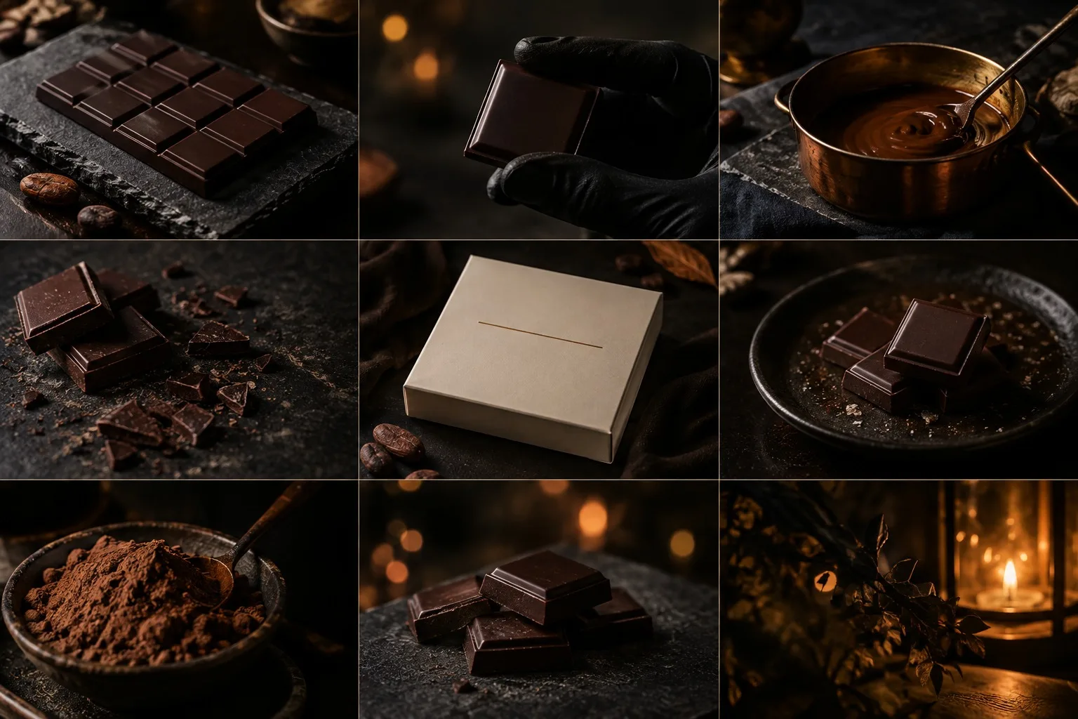
The shoot. We shot everything in one afternoon, in the kitchen, in the light from the north window. The family worked while we photographed, so every picture has a real quality of use: a gloved hand, a broken square, a dusting of cocoa on slate.
The photographer worked slowly and rarely moved a prop. We asked her not to style. The kitchen was already styled by decades of being useful.
The image grid
The campaign image is a grid of nine frames, kept at the same size on purpose, in a three-by-three. Reading across: a bar on slate; a gloved hand holding a single square; copper pan and spoon; broken squares and crumbs; the cream box with its one line; squares on a dark plate; cocoa in a bowl; a stack of bars; and a lantern, the last light of the morning.
No frame is larger than another. We don't tell the viewer which to prefer.
Windows, shops and what we learned
Both shops took the same treatment. We replaced the usual display with one tray, one bar, and a lamp. The shopkeepers worried it was too sparse. By the second week they had stopped worrying, because the bar on the tray sold out each day.
What we learned. That a family business with a real kitchen needs very little invention, only editing. That the best thing a designer can do for the right client is take things away until the client recognises themselves.
And that twelve bars is the right number. Eleven would have left a hole in the box. Thirteen would have been a mistake.
Keep reading Firefly Studio
New essays delivered when ready. One short email a month, never more.