rebrand · Aug 19, 2026
Rebranding a Small Hotel Without Touching the Door
The Wenlow Hotel wanted a new identity and no new building. Eleven weeks, one typeface, a brass key, and the discipline of changing almost nothing.
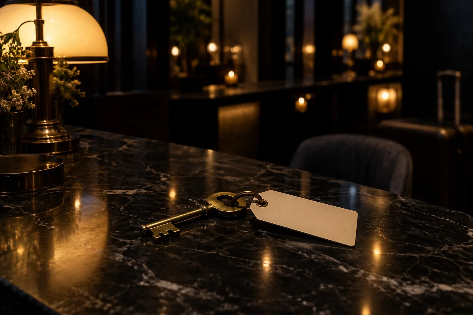
The Wenlow Hotel has nineteen rooms and a front door that hasn't changed in a hundred years. The owners asked for a rebrand. They also asked us not to touch the door.
We agreed to both. That was the project.
The problem with new
Most hotels that rebrand do it loudly. A new logo, a new colour, a new sign over the entrance, and a launch party for people who had been coming anyway. The result is a hotel that feels newly opened and slightly nervous about it.
The Wenlow wanted the reverse. It wanted its regulars to arrive and think nothing had happened, and its first-time guests to feel they'd found something that had always been there. So our brief to ourselves was a quiet one: change everything that is printed, and leave everything that is built.
One typeface
We chose a single serif and used it for everything. The sign, the menu, the key tag, the bill. Not two typefaces and a script for contrast. One.
It has a low, steady rhythm and a slightly old-fashioned capital R that the owners fell for immediately. We used it at two sizes and in one weight, and we did it everywhere. Within a month, the hotel looked like itself in every corner.
A key worth holding
The room key had been a plastic card. We replaced it with a heavy brass key on a cream tag, stamped with the room number in that single typeface. The lock behind it was the same as before, a card reader hidden in the door. The key is a decoy: a thing to hold, hang on a hook and take to dinner.
Guests started leaving the keys on their pillows when they checked out, as a kind of thank-you. We didn't plan that. We never mentioned it to the staff either, and it still happens.
What went, and what stayed
What we removed:
The old crest, which nobody could name the origin of.
Four shades of green that had accumulated in the printed material over the years.
A tagline. The hotel is called The Wenlow. That is enough.
What we kept. The door. The brass handle on it. The slight smell of beeswax in the hall. A faded runner on the second flight that the owners wouldn't let us replace, and we're glad.
Eleven weeks
The work took eleven weeks, mostly spent listening. We stood behind the desk for two mornings. We read the old guest book. We asked the night porter what people forgot.
The finished identity runs to a short document. It fits on four sheets of cream paper. The rule at the top says: nothing should look designed.
Our favourite review so far says, simply, "It felt like it had always been this way." We'd frame that and hang it in the hall, but the owners would say it wasn't necessary.
Keep reading Firefly Studio
New essays delivered when ready. One short email a month, never more.